The Psychology of App Icons: How Colors and Shapes Influence Downloads
Have you ever wondered why social media apps are often blue, or why food apps use warm colors like red and orange? It's not a coincidence—it's Icon Psychology. In the competitive landscape of the digital marketplace, your icon is the single most important asset for conversion. It is the visual handshake between your software and a potential user.
In the crowded App Store, your icon has milliseconds to grab a user's attention. Understanding the psychological impact of your design choices can be the difference between a scroll-past and a download. This guide dives deep into the cognitive science behind icon design.
The Power of Color Theory in ASO
Colors aren't just decorative; they are emotional triggers. When a user browses the App Store, their brain processes color faster than text. This is why choosing a primary color for your icon is a strategic decision that affects your App Store Optimization (ASO).
The Blues: Trust and Authority
Blue is the most popular color for apps globally. It signifies stability, trust, and intelligence.
- Trust & Security: Used by Facebook, Twitter (now X), LinkedIn, and most banking apps (Commerzbank, Chase).
- Professionalism: Blue suggests a "safe" choice.
- Subconscious Link: Blue is associated with the sky and ocean, which are pervasive and calm.
The Reds: Urgency and Passion
Red is an "action" color. It increases heart rates and creates a sense of urgency.
- Excitement: Used by YouTube, Netflix, and Tinder.
- Hunger: Many food apps (DoorDash, Yelp) use red because it is known to stimulate appetite.
- Warning: Be careful, red can also signal "stop" or "danger."
The Greens: Growth and Vitality
Green signifies health, wealth, and natural growth.
- Vitality: Used by Spotify, WhatsApp, and Whole Foods.
- Finance: In many cultures, green is the color of money, making it a popular choice for wealth-sharing apps like Cash App.
The Yellows and Oranges: Optimism and Warmth
These colors are hard to miss. They scream for attention.
- Optimism: Used by Snapchat and Bumble.
- Approachability: Orange is often seen as a friendlier, less aggressive version of red.
Cultural Color Variations
It's vital to remember that color psychology isn't universal. While green means "wealth" in the west, in some cultures, it can signify something else entirely. If you are launching globally, research the local color symbolism. Ignoring this is one of the Common App Icon Mistakes.
The Evolution of Icon Design: From Skeuomorphism to Neumorphism
To understand today's psychology, we must look at the history of mobile design.
The Skeuomorphic Era (2007-2012)
When the iPhone first launched, users weren't used to touch surfaces. Icons looked like real-world objects (leather, glass, metal) to tell users how to interact with them. The psychology here was familiarity.
The Flat Design Revolution (2013-Present)
With iOS 7, Apple moved to "Flat Design." The psychology shifted from familiarity to efficiency and clarity. We no longer needed a "real" button to know it was clickable. This simplified cognitive load, allowing users to scan screens faster.
The Rise of the "Squircle"
Apple's mandate for the "squircle" (a square with rounded corners, but using a specific mathematical formula called a Lamé curve) isn't just aesthetic consistency; it's friendly. Sharp corners can feel aggressive or dangerous in nature, while circles are soft but harder to align in a grid. The squircle offers the best of both worlds: stability and approachability. It creates a "container" that users trust. You can learn more about platform-specific shapes in our iOS vs. Android Icon Guidelines.
Shape and Symbolic Dynamics
Beyond the container, the shapes inside your icon communicate your app's DNA.
Circles and Ovals
Circles signify unity, community, and infinity. They are welcoming and suggestive of a "whole" experience. Apps like Instagram (the inner lens) use circular elements to create a focal point.
Squares and Rectangles
These shapes represent stability, balance, and reliability. They are the "bricks" of design. Enterprise and productivity tools often lean into these sturdy shapes.
Triangles and Diagonals
Triangles signify direction, movement, and power. An upward-pointing triangle suggests growth, while a sideways one (like a "play" button) suggests action and entertainment.
Cognitive Load: The "Less is More" Principle
One of the most profound psychological bars to download is "Cognitive Overload." If a user's brain has to work too hard to understand what your icon represents, they will subconsciously move to the next item.
The 5-Foot Rule
Imagine your phone is 5 feet away. Can you still tell what the icon represents? If not, it's too complex. High-converting icons usually have:
- A single focal point.
- No text (text is for the title, icons are for symbols).
- High contrast between the foreground and background.
Branding and Emotional Resonance
Your icon is the "face" of your brand. Think of the Starbucks mermaid or the Apple logo. These aren't just images; they are vessels for emotion. Your goal is to create an icon that makes the user feel the benefit of your app before they even open it.
If your app is a meditation tool, use soft gradients and organic shapes. If it's a high-octane racing game, use bold slashes and high-contrast color pairings.
Testing Your Assumptions: The Power of A/B Testing
Psychology gives us a framework, but data provides the truth. Never assume your design is perfect based on theory alone.
- Store Listing Experiments: Google Play and the App Store allow you to test different icons with real users.
- The Results: Often, a small change in background brightness or the size of a central symbol can increase conversion by 10-20%.
Case Studies: Success Through Psychology
Instagram's Rainbow Gradient
When Instagram moved from its skeuomorphic brown camera to a purple-pink-orange gradient, it was controversial. However, the psychology was sound: the gradient captured the "warmth" and "vibrancy" of social connections better than a static brown object. It shifted from being a "camera tool" to a "social platform."
Slack's Logo Simplification
Slack originally had an 11-colored hashtag. It was distinct but failed the "Scalability" test (see 10 Common App Icon Mistakes). Their redesign used only 4 primary colors and simplified the geometry, making the icon processable by the brain much faster.
Future Trends for 2025 and Beyond
As we move further into the decade, new psychological drivers are emerging in icon design.
- Dynamic Customization: With iOS 18+ and Android 14+, users can now choose different "variations" of your icon (Light, Dark, Colored). The psychology here is Autonomy. Users want your app to fit their aesthetic, not just your brand.
- Minimalist Depth (Neumorphism): We are seeing a return of subtle depth. Not the heavy textures of 2010, but soft shadows that give icons a "tactile" feel. It satisfies the brain's desire for touch even on a flat glass screen.
- AI-Generated Imagery: While generative AI is everywhere, the most successful icons are still human-refined. An AI might choose the right colors based on prompt data, but a human understands the target audience's emotional triggers.
Conclusion: The Holistic View
Designing a great icon is a balance of art and science. By leveraging color theory, understanding historical context, and respecting the constraints of human cognition, you can create an asset that doesn't just look "pretty"—it converts.
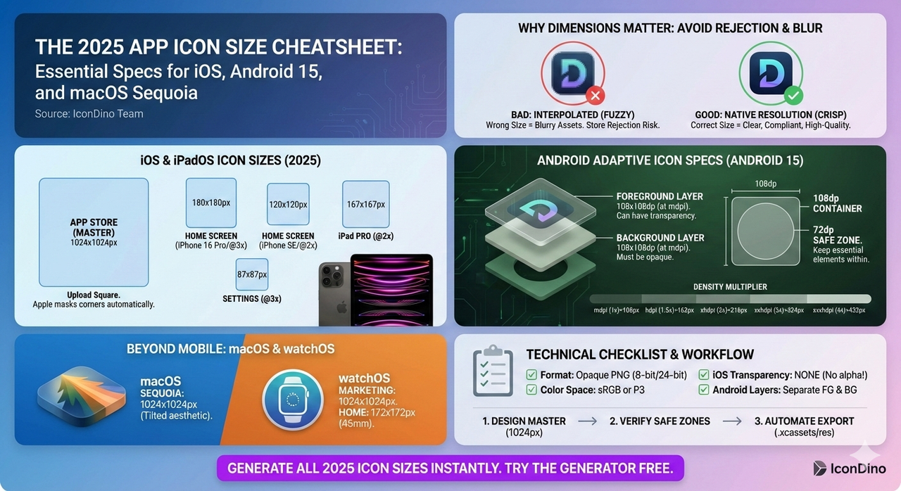
Remember, the best icon in the world is useless if it's not exported correctly for the devices users actually own. Be sure to check our guide on the Exporting Workflow for Xcode and Android Studio to ensure your psychologically optimized design looks crisp on every screen.
Ready to Design?
Don't let a bad icon hold your app back. Create a professional, psychologically optimized icon in seconds with our free tool.