The Ultimate Guide to App Icon Sizes: iOS, Android, macOS, and Beyond
In the fast-moving world of mobile and desktop development, staying compliant with the latest pixel requirements is a constant battle. Apple and Google frequently update their hardware and software, leading to new screens, higher resolutions, and changing icon specifications.
If you've ever had an app rejected because of a missing 120x120px icon or found your Android logo looking "off" on a new device, this guide is for you. Here is the definitive, up-to-date breakdown of app icon sizes for 2025.
Why Exact Pixel Dimensions Matter
An app icon isn't just one image; it's a family of assets. Depending on where the user sees your app—the home screen, the settings menu, a notification, or the App Store—the system selects a different file version.
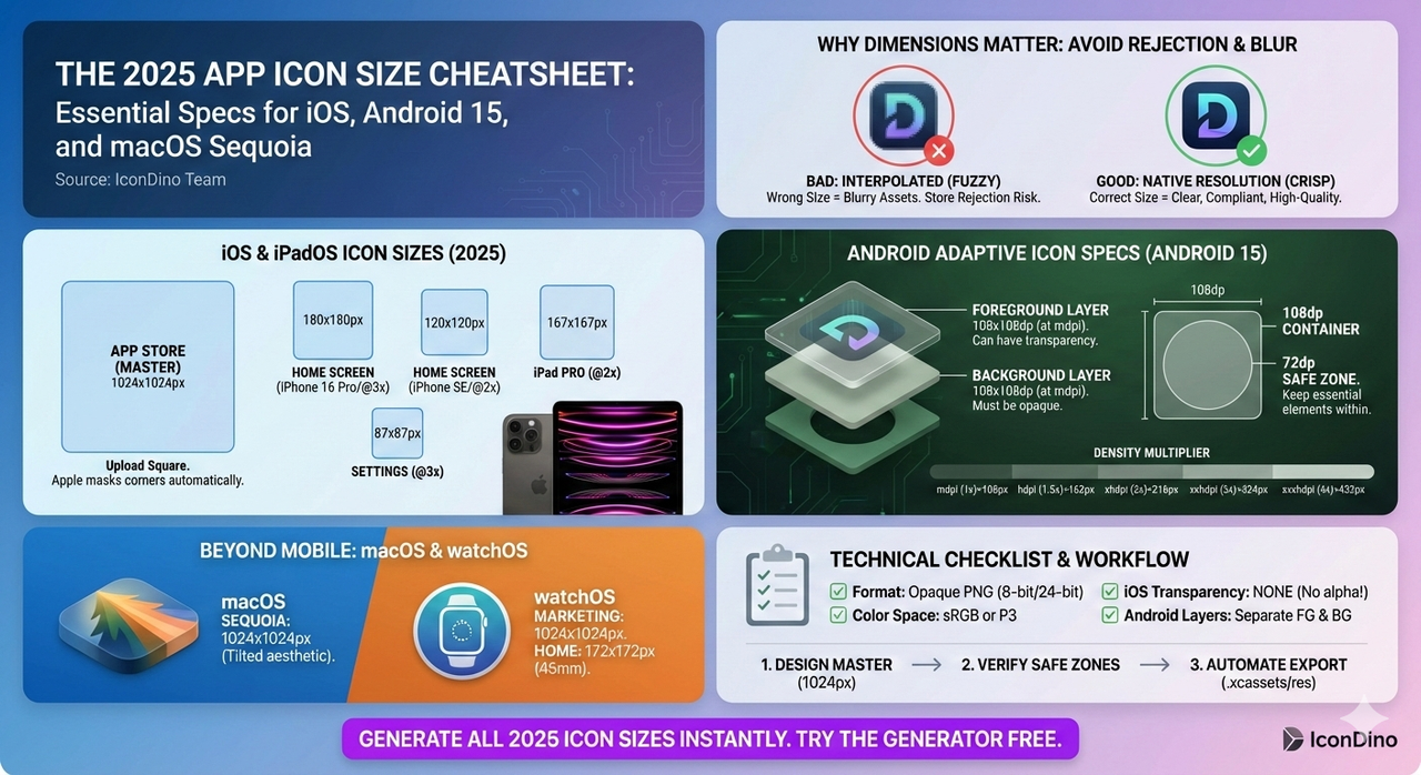
- Clarity: Using the wrong size causes "interpolation," which makes your icon look blurry or "fuzzy."
- Compliance: App Store Connect and Google Play Console will often block your submission if critical sizes are missing.
- Brand Perception: A crisp icon signals a high-quality app.
Official iOS & iPadOS Icon Sizes (2025)
Apple uses several different sizes to support the various resolutions of the iPhone, iPad, and Apple Watch. Remember that you should always design for the highest resolution (@3x) and scale down.
| Use Case | Device | Size (Pixels) | Scale |
|---|---|---|---|
| App Store | All Devices | 1024 x 1024 | 1x |
| Home Screen | iPhone 16 Pro/15/14 | 180 x 180 | 3x |
| Home Screen | iPhone SE / Older | 120 x 120 | 2x |
| Home Screen | iPad Pro / iPad | 167 x 167 | 2x |
| Settings | All iPhones | 87 x 87 | 3x |
| Notifications | All iPhones | 60 x 60 | 3x |
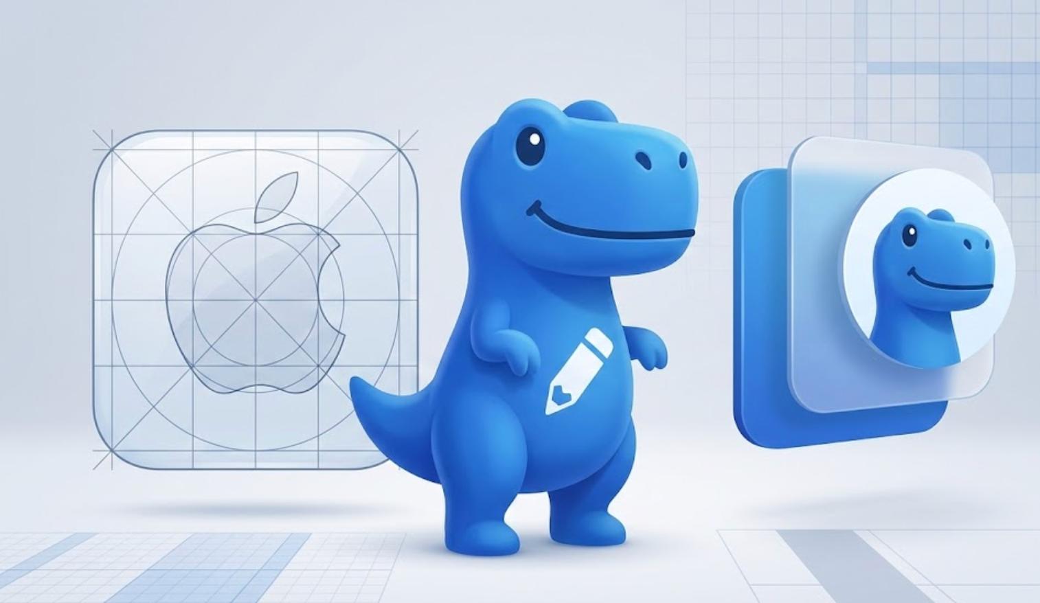
Pro Tip: Apple’s system automatically applies the "squircle" mask. You must provide a square image without rounded corners. For a deeper dive into Apple's design philosophy, see our iOS vs. Android Icon Guidelines.
Android Adaptive Icon Specifications
Android 15 continues the tradition of Adaptive Icons, which are significantly more flexible but technically more complex than iOS icons. Instead of a single image, you provide layers.
The Container
The master asset for an Android icon is 108x108dp.
The Layers
- Background Layer: 108 x 108 pixels (at mdpi). Must be opaque.
- Foreground Layer: 108 x 108 pixels (at mdpi). Can have transparency.
The Safe Zone
While the asset is 108dp, the system applies various masks. To ensure your logo isn't cut off, keep all essential elements within the 72dp inner circle.
| Density | Modifier | Size (Pixels) |
|---|---|---|
| mdpi | 1.0x | 108 x 108 |
| hdpi | 1.5x | 162 x 162 |
| xhdpi | 2.0x | 216 x 216 |
| xxhdpi | 3.0x | 324 x 324 |
| xxxhdpi | 4.0x | 432 x 432 |
macOS, watchOS, and tvOS Requirements
Don't forget the rest of the ecosystem! If you are building a cross-platform app, you need these specific dimensions.
macOS (Sequoia & Sonoma)
macOS icons have a specific "tilted" or "3D" aesthetic defined by Apple, though the containers remain square.
- Primary Size: 1024 x 1024 px
- Standard Sizes: 512x512, 256x256, 128x128, 32x32, 16x16.
watchOS
- App Store: 1024 x 1024 px (For marketing)
- Home Screen: 172 x 172 px (for 45mm watches) to 108 x 108 px (for 38mm).
Technical File Requirements
Beyond sizes, your files must meet these technical standards to be accepted by the stores:
- Format: Opaque PNG (8-bit or 24-bit).
- Color Space: sRGB or P3.
- Layers: iOS requires flattened images; Android requires a separate background and foreground if you want motion effects.
- No Transparency: iPhone home screen icons cannot have transparent pixels. If they do, they will appear with ugly black or white boxes behind them.
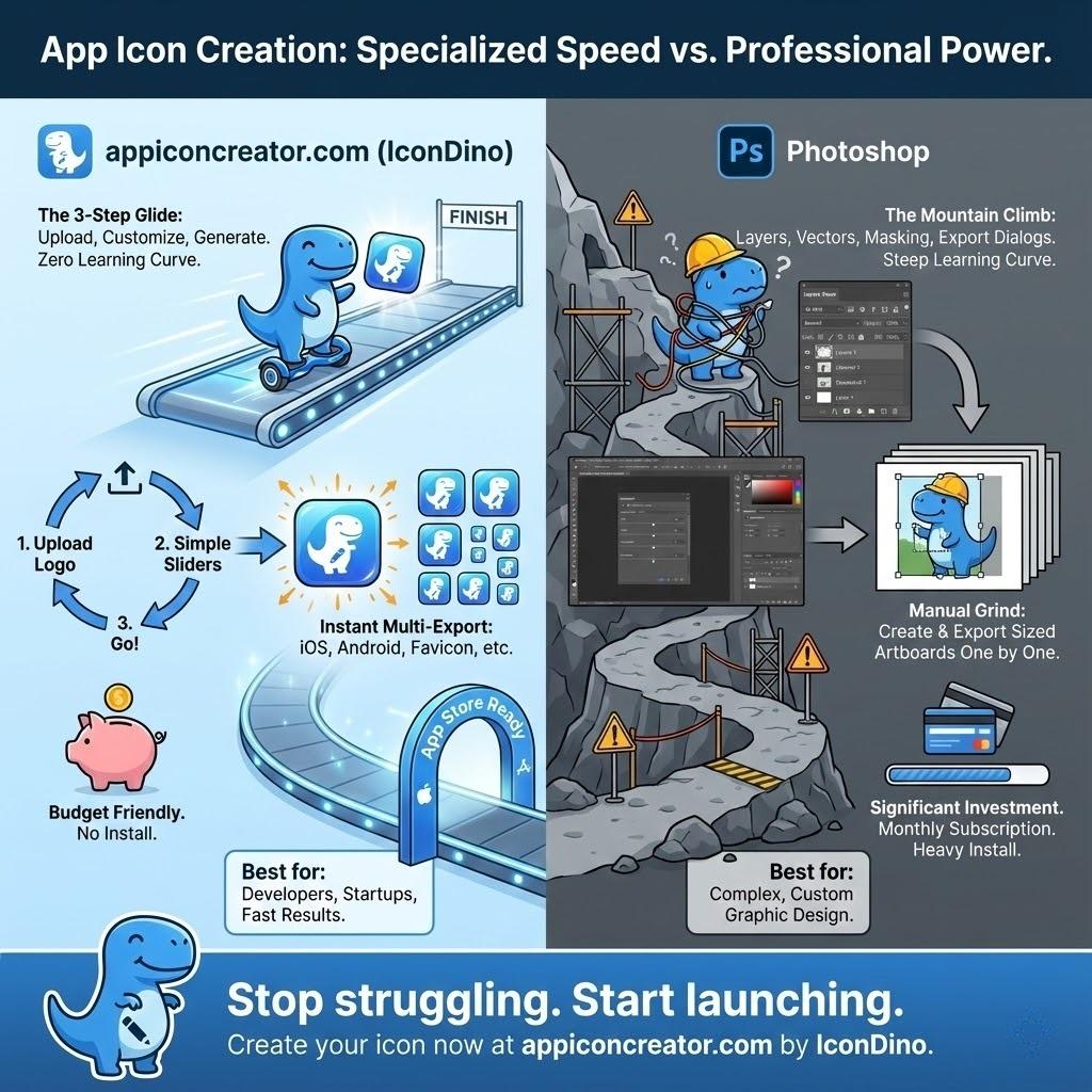
Managing the Chaos: The Automated Workflow
Manually resizing an icon into 30+ different files is the most common cause of "Build Failures" in mobile development. This is why professional teams use automated tools.
- Design Once: Create your master logo at 1024x1024px.
- Verify Safe Zones: Ensure your logo doesn't bleed into the corner-rounding areas.
- Generate Assets: Use a dedicated tool to output the complete
.xcassets(iOS) orres(Android) folder structure. - Drag & Drop: Place the folders directly into your project.
For a step-by-step on how to do this in your IDE, check our guide on Exporting Icons for Xcode and Android Studio.
Conclusion
Icon sizes are more than just numbers—they are the key to a professional, platform-native look. By understanding the specific needs of iOS and Android in 2025, you ensure your app makes the best possible first impression on every user.
Stop wasting time with "Export Selection As..." and let automation handle the grunt work.