Photoshop vs. AppIconCreator: Why You Don’t Need Expensive Software for Icons
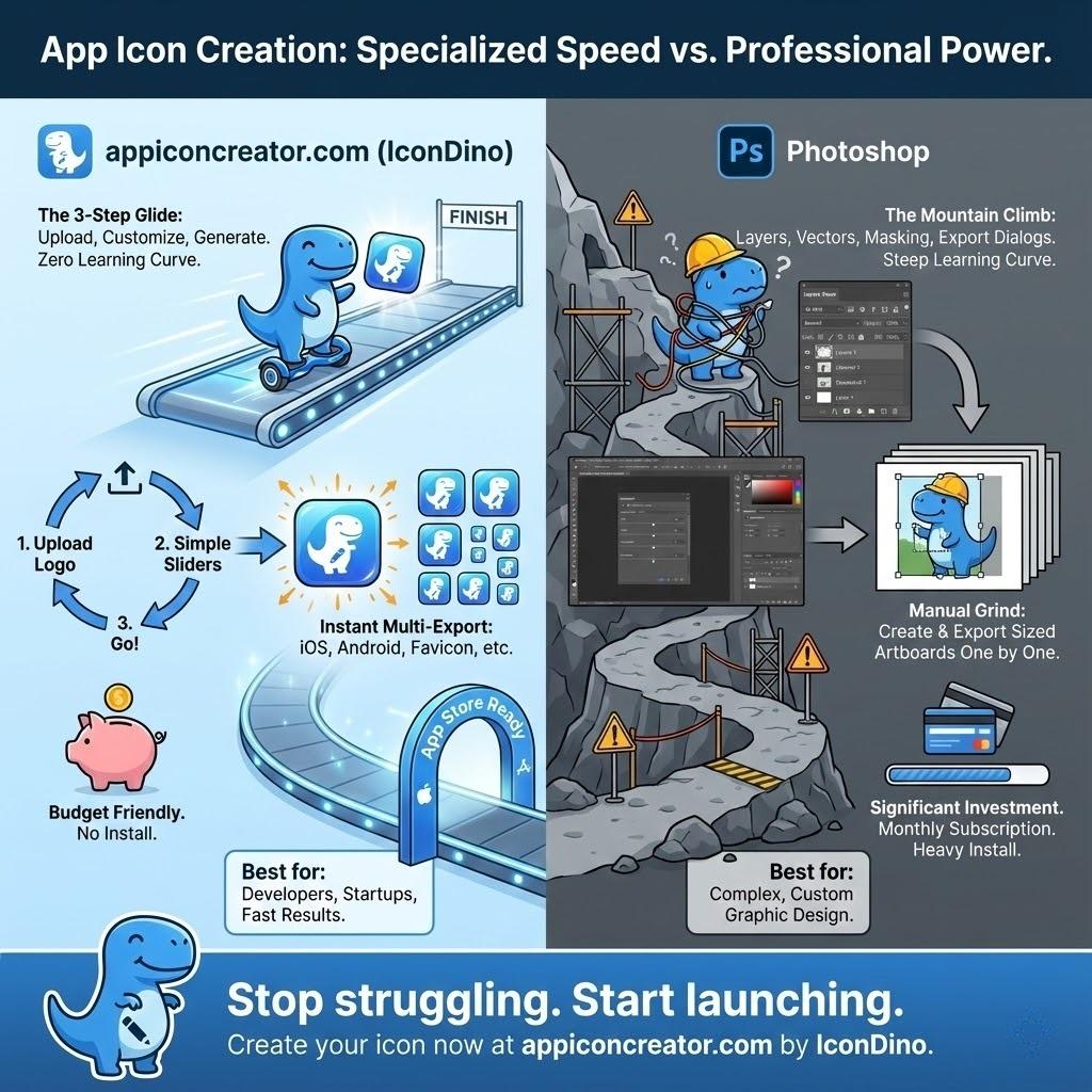
In the early days of mobile development, if you wanted a professional app icon, you had one choice: Adobe Photoshop. You’d open a massive 3GB application, spend 20 minutes setting up a grid of artboards for every conceivable resolution, and meticulously export dozens of PNG files while praying you didn't miss a single pixel.
But it’s 2025. The "Generalist" era of design software is giving way to the "Specialist" era. While Photoshop remains the king of photo manipulation, using it for app icons is like using a sledgehammer to hang a picture frame—it’s overkill, it’s slow, and it often leaves a mess.
If you’re looking for a free alternative to Photoshop for icons, or wondering if a free icon generator vs paid software is worth your time, this guide is for you. We’re going to break down why specialized tools like AppIconCreator (IconDino) are not just a "budget" choice, but the better choice for modern developers.
The 20-Minute Artboard Trap
Ask any seasoned designer about their "Icon Template" in Photoshop. It likely involves a complex file with dozens of slices, smart objects, and a legacy export script that breaks every time Adobe updates the Creative Cloud. This is the hidden cost of high-end software: the time spent maintaining the environment rather than building the product.
When you use Photoshop, you aren't just designing; you're managing infrastructure. Consider the typical workflow for a new project:
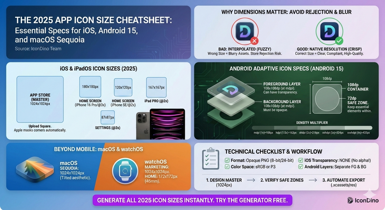
- Preparation: 5-10 minutes setting up the 1024x1024 master and the corresponding export artboards (20x20, 29x29, 40x40, 60x60, etc.). You have to ensure each artboard is perfectly aligned to the pixel grid to avoid "half-pixel blur" on smaller devices.
- Design: The actual creative work. This is where you should be spending 100% of your time, but in Photoshop, it’s often just a fraction.
- Refactor: Adjusting the design. If you change a color or a stroke width, you have to ensure that change propagates correctly to every single artboard. If you didn't set up "Smart Objects" correctly, you're looking at manual updates across 20+ layers.
- Export: Running scripts, naming files manually, and checking for transparency issues. If even one file is named
icon_40x40_2x.pnginstead oficon_40x40@2x.png, your build system will throw an error.
Total time per iteration? Roughly 20 to 30 minutes.
In contrast, a specialized tool like AppIconCreator takes 20 seconds. By removing the need for manual artboard management, you eliminate the single biggest bottleneck in the design process. You upload your logo or pick a symbol, choose your colors, and hit "Download." The system handles the scaling, the naming conventions, and the platform-specific quirks automatically. When you're trying to ship an MVP or testing a new idea, that 19-minute difference isn't just a convenience—it’s a competitive advantage.
The Cost Crisis: Subscription Fatigue
Let’s talk about the elephant in the zoom: the cost. Adobe’s subscription model is a significant hurdle for solo developers, indie hackers, and small startups. Paying $20-$50 a month for a tool you only use for one specific asset is a poor allocation of resources. Over a year, that’s $240 to $600 spent on software that’s largely doing work that a dedicated web tool could do for free or for a fraction of the cost.
When comparing a free icon generator vs paid suites, the value proposition of a specialized web tool becomes clear. Why pay for a 747 when you just need to cross the street?
Even if you already have a subscription for other work, there is a "cognitive cost" and a "system cost" to Photoshop. It’s a heavy program that drains battery and RAM. If you're working from a laptop in a coffee shop, opening Photoshop can cut your working time in half. AppIconCreator runs in your browser, requires zero installation, and is optimized for one thing: making your app look great on a home screen without killing your hardware.
SEO and ASO: Why Photoshop Fails the Store Listing Test
App Store Optimization (ASO) is often discussed in terms of keywords and descriptions, but the most critical component is your click-through rate (CTR). Your icon is the primary driver of CTR. Every user who searches for "fitness tracker" or "finance app" will see a wall of icons. Yours must tell a story in a fraction of a second.
A common mistake made in Photoshop is designing "too close." Photoshop’s interface encourages you to zoom in to 400% or 800% to perfect a single pixel. But a 1024px icon on your 4K monitor is a world away from a 120px icon on a user's iPhone. Details that look magnificent at full size often turn into "visual noise" when scaled down.
Specialized generators solve this by providing real-time previews in "context." As you slide a color picker or adjust a shadow, you see exactly how it will look in a "Psychology of App Icons" context (check our guide on The Psychology of App Icons for more on this). You can immediately see if your symbol is large enough to be recognized or if your colors have enough contrast to "pop" against a dark wallpaper.
Furthermore, SEO for your web presence depends on fast, optimized assets. While Photoshop has a "Save for Web" feature, it requires manual tweaking to get the file size down without losing crispness. A modern generator uses server-side optimization and modern image formats (like WebP and optimized PNGs) to give you the perfect balance of quality and speed right out of the box. This ensures your website loads fast, which is a key ranking factor for Google SEO.
Platform Guidelines: The War of "Squircles" and Layers
The mobile landscape is not a monolith. Designing an icon that works for both iOS and Android requires navigating a minefield of conflicting technical specifications.
- iOS Apple Design Language: Requires a perfectly flat, opaque square. The "Squircle" shape (a mathematical hybrid of a square and a circle) is applied by the OS. If you provide an icon with pre-rounded corners in Photoshop, you risk seeing white slivers at the edges on different OS versions or having your icon look "double-rounded" and amateurish.
- Android Material Design: Uses "Adaptive Icons." This is a more complex system where the icon is split into two separate layers: a foreground symbol and a background layer. This allows the Android OS to apply parallax effects, animations, and different masks (circle, square, teardrop) depending on the user's settings.
Attempting to manage these two distinct workflows in Photoshop is a recipe for disaster. It requires careful layering, specific naming conventions, and multiple exports. If you mess up the transparency or the layering for Android, you'll end up in our list of 10 Common App Icon Mistakes.
A specialized generator like AppIconCreator has these rules "baked in." It understands the mathematical formula for the iOS squircle and the exact dimensions for the Android safe zone. It generates the correct assets for both platforms without you having to read a single developer document. It’s built-in expertise that saves you from rejection in the App Store review process.
The Learning Curve Trap
Photoshop is a professional tool designed for people who make a living with their mouse and keyboard. It has a steep, often intimidating learning curve. If you aren't already an expert, you’ll spend hours on YouTube learning how to use the Pen Tool, how to manage Layer Styles, or how to avoid "destructive" editing.
For a high-converting app icon, you don't need a Pen Tool. In fact, most "hand-drawn" icons perform worse than clean, symbolic ones. What you actually need is:
- A clean background: Often with a subtle, professional gradient.
- A centered, high-contrast symbol: That represents your app's core function.
- A soft, consistent shadow: That suggests depth without looking dated.
By limiting your choices to what actually works, a dedicated tool prevents you from making bad design decisions. It’s like a "guardrail" for your branding. It keeps you focused on the principles of ASO and user psychology rather than the technical minutiae of a complex software suite. If you want to dive deeper into what makes a "working" icon, see our iOS vs. Android Icon Guidelines.
Exporting for Developers: The Final Hurdle
Even after you've designed the perfect icon in Photoshop, the technical work is only beginning. The distance between a "design" and a "shipping asset" is paved with folder structures and JSON files.
- Xcode (iOS/macOS): Requires an
.appiconsetfolder containing up to 20 different PNG files, each with a specific name, and aContents.jsonfile that maps those names to the correct "slots" (e.g., iPhone Notification 2x, iPad Pro App 2x). - Android Studio: Requires various
mipmapfolders (hdpi, xhdpi, xxhdpi, xxxhdpi) and XML files for the adaptive icon configuration.
Manually dragging and dropping 40+ files into these folders is a recipe for human error. One misplaced file can cause your build to fail, or worse, your icon to look blurry on the newest high-resolution devices. We've written extensively about the Exporting Workflow for Xcode and Android Studio, and the consensus is clear: automation is no longer optional; it’s a requirement.
A specialized generator gives you a single, perfectly formatted zip file. You just drag, drop, and deploy. This level of integration is something a general-purpose tool like Photoshop can never provide natively.
The Value of Specialization in a Competitive Market
In the tech world, we often talk about "Product-Market Fit." But there’s also "Tool-Task Fit." Using Photoshop for icons is using a tool that's too big, too expensive, and too slow for the task at hand.
In a competitive market where "Speed to Ship" is a primary metric of success, every minute counts. Whether you’re an indie dev building your fifth app or a product manager at a startup, your time is better spent on your product’s logic, user acquisition, and business strategy than on artboard management.
By choosing a free alternative to Photoshop for icons like AppIconCreator, you aren't "settling" for a lesser tool. You're choosing a specialized instrument that does one thing perfectly. You're ensuring that your icon meets every technical requirement, follows every psychological best practice, and is ready for the App Store in the time it takes to brew a cup of coffee.
Conclusion: Stop Fighting Your Software
The era of the "all-in-one" design suite is over for mobile assets. Photoshop is an incredible tool for digital painting, complex photo editing, and high-end graphic design. But for the specific, highly-regulated world of mobile app icons, it’s an outdated workflow that adds unnecessary friction to your development cycle.
AppIconCreator (IconDino) offers a better way. It combines the power of automation with the wisdom of ASO best practices to give you professional results without the professional price tag.
Stop fighting with artboards. Stop worrying about naming conventions. Stop paying for features you don't use. Choose the right tool for the job, and focus on what really matters: building an app that people love.
Ready to Upgrade Your Workflow?
Join thousands of developers who have swapped the Photoshop struggle for a 20-second workflow. Experience the speed of a specialized icon generator today. No artboards, no subscriptions, just perfect icons—every time.