iOS vs. Android Icon Guidelines: The Ultimate 2025 Handbook
Designing a mobile application in 2025 means navigating two radically different design philosophies: Apple's "Human Interface Guidelines" (HIG) and Google's "Material Design 3". While both platforms have converged on certain aesthetic trends, the technical requirements for app icons remain worlds apart.
This handbook is designed to be the go-to resource for developers and designers who need to move past the basics and understand the deep technical nuances of platform-compliant icons.
The Core Philosophies
Apple's Uniformity
Apple values a unified home screen. Every icon must adhere to the same physical shape. While you design a square, the system applies a mask. This ensures that no matter how unique your app is, it feels like it belongs in the iOS garden.
Google's "Adaptive" Diversity
Google empowers users and device manufacturers. An Android icon isn't a fixed shape; it's a multi-layered asset that adapts to the system theme. This allows for a dynamic experience where icons can morph from circles to squares to teardrops based on a user's settings.
Apple iOS Icon Specifications (HIG)
Apple's requirements are rigid but predictable. The key is understanding that you are designing for a specific "Safe Area" within a square container.
1. The Container and Shape
You must provide a square image. Do not round the corners yourself. If you do, you will see thin black or white edges around the "squircle" once Apple applies its own mask.
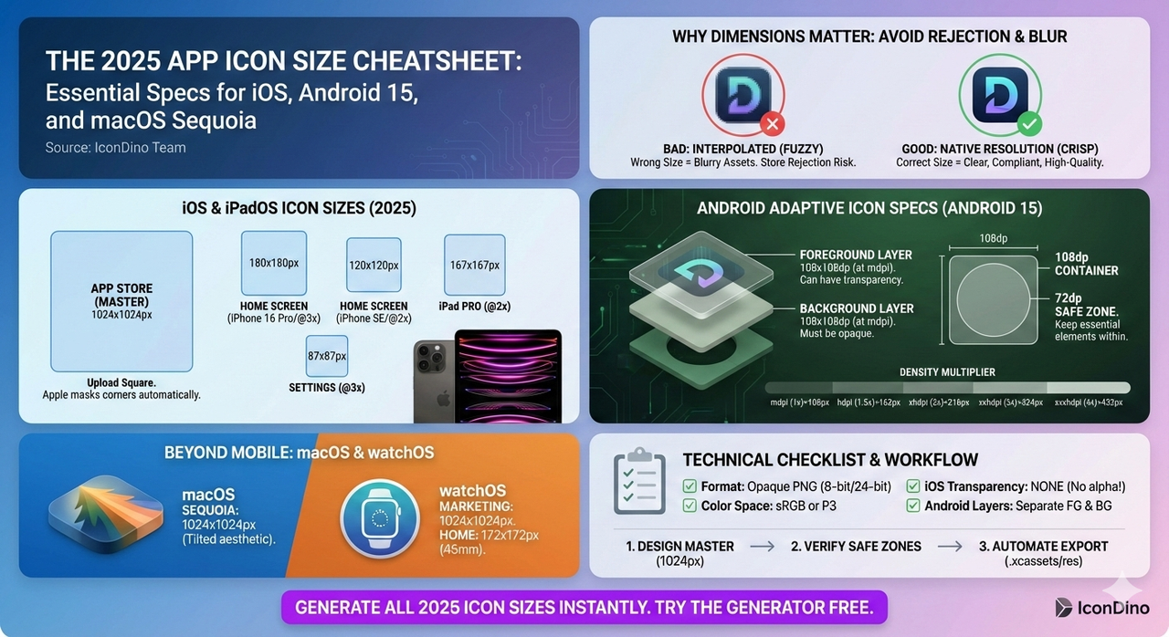
- Design Size: 1024x1024 pixels.
- Format: Opaque PNG (No transparency allowed).
- Color Space: sRGB or P3 (for wide color devices like newer iPhones).
2. The Apple Grid System
Apple provides a standard grid system for its icons. It consists of concentric circles and squares that define "Safe Zones."
- Central Focal Point: Place your primary logo within the inner 80% of the square.
- Margins: Avoid placing critical detail near the edges, as the rounding of the corners is quite aggressive and can cut off parts of your logo if it's too large.
3. Shadows and Lighting
In the modern era of iOS design, Apple prefers flat or subtle gradient backgrounds.
- Avoid: Heavy, artificial drop shadows that go outside the icon bounds (since they won't render anyway).
- Embrace: Selective lighting. A subtle top-to-bottom vertical gradient can add depth without making the icon look dated. For a deeper look at the emotional impact of these choices, see The Psychology of App Icons.
Google Android Icon Specifications (Material Design)
Android's "Adaptive Icons" are the gold standard for modern mobile design, but they are significantly more complex to build.
1. The Layered Architecture
An adaptive icon consists of two separate layers:
- Background Layer: 108x108dp. This can be a solid color, a gradient, or an image. It must be opaque.
- Foreground Layer: 108x108dp. This usually contains your logo or primary symbol. It can have transparency.
2. The Interaction of Layers
When the user moves their phone or scrolls through their app drawer, Android uses these two layers to create a parallax effect. The background moves at a different speed than the foreground.
- Safe Zone (72dp circle): While the asset is 108dp, only the center 72dp is "safe." Everything outside this circle may be masked off depending on the user's icon shape.
- Expansion Area: The extra 18dp on each side is used for those motion effects. Essential graphics should never bleed into this area.
3. Android Monochrome Icons (Themed Icons)
Since Android 13, Google introduced themed icons. If a user enables this, your colorful icon is replaced by a monochrome version that matches the user's system wallpaper.
- Requirement: You must provide a separate vector drawable (SVG/XML) that is a flat, single-color version of your logo.
- Benefit: This is great for SEO and user satisfaction, as it makes your app feel like a first-class citizen in the Android ecosystem.
Technical Comparison Table
| Feature | iOS requirement | Android Requirement |
|---|---|---|
| Shape | Squircle (Applied by OS) | Adaptive (Circular, Square, etc.) |
| Layers | Single (Flat) | Multi (Background + Foreground) |
| Transparency | Not Allowed | Allowed only on Foreground |
| Main Size | 1024x1024px | 108x108dp (Master) |
| Format | PNG (High res) | PNG / Vector Drawable (XML) |
Critical Differences in Production
The "White Border" Issue
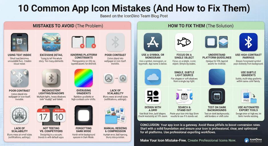
Often, developers export a logo with a transparent background for Android but forget to provide the background layer. This results in the system surrounding the logo with a default white border, which looks unprofessional. This is a classic example of what we cover in 10 Common App Icon Mistakes.
Resolution Scaling
- iOS uses @1x, @2x, and @3x scaling factors. You need to generate about 15-20 different PNG files to support everything from iPhone SE to the iPad Pro.
- Android uses a density-independent pixel (dp) system with qualifiers like
mdpi,hdpi,xhdpi,xxhdpi, andxxxhdpi.
Managing this manually is a nightmare. This is why a streamlined Exporting Workflow for Xcode and Android Studio is essential for any modern development team.
A Note on App Store Optimization (ASO)
Your icon doesn't just need to be technically correct; it needs to be visible.
- Contrast: Ensure your logo pops against both light and dark backgrounds.
- Distinctiveness: If every other app in your category is blue, consider a different color to stand out in search results.
- Simplicity: Users browse fast. A complex icon is a forgotten icon.
Accessibility in Icon Design
Accessibility isn't just for UI text; it applies to your icon as well. Low vision users or those with color blindness need to be able to identify your app in a sea of dozens.
- Luminance Contrast: Ensure that the foreground logo has enough luminance contrast against the background. A dark blue logo on a navy background is an accessibility failure.
- Simple Geometry: Highly complex shapes can appear as "blurs" to someone with impaired vision. Clean, geometric symbols are the most accessible.
- Color Blindness Considerations: While your primary brand color is important, don't rely on color alone to distinguish your icon. The shape of the logo should be distinctive enough that a user who sees in grayscale can still recognize it.
Testing on Real Devices
A common mistake is designing an icon on a 27-inch 5K monitor and never looking at it on a 5-inch phone screen.
- Check for "Blobbing": At small scales, do your thin lines disappear? Do your tight spaces close up?
- Color Temperature: Different screens have different color profiles (OLED vs. LCD). Your vibrant orange might look like a muddy brown on an older Android device or a cheap tablet.
- Home Screen Context: Use a tool that allows you to preview your icon on a real home screen. This provides the context of "neighbors"—other apps that will be surrounding yours.
Maintaining Brand Identity Across Platforms
The challenge is to follow the technical rules of both Apple and Google while keeping your brand recognizable.
- The Consistent Core: Your primary logo or symbol should be identical on both platforms. It is the steady hand of your brand.
- Adaptive Backgrounds: On Android, lean into the adaptive background layer by using your brand's primary color or a subtle version of your brand's unique pattern.
- The Emotional Link: Ensure that the lighting and "mood" of the icon match. If your iOS icon has a subtle gradient, try to mirror that energy in your Android background layer. For more on the emotional impact of design, see our article on The Psychology of App Icons.
Conclusion
Mastering the technical specifications for iOS and Android isn't just about following rules—it's about respecting the platforms your users love. By providing high-quality, technically-compliant assets, you signal to both Apple/Google and your users that your app is a professional, high-quality product.
Don't spend your day manually resizing layers. Use a tool that understands these guidelines inside and out. Check our Exporting Workflow for Xcode and Android Studio to see how to streamline this entire process.
Need Both Formats Now?
Get perfectly masked iOS squircles and adaptive Android layers in seconds.