10 Common App Icon Mistakes (And How to Fix Them)
Even the most brilliant app, with the smoothest code and the most innovative features, can fail if its icon looks amateurish. In the world of App Store Optimization (ASO), your icon is the single most important asset for conversion. It’s the visual handshake that invites a user into your digital home.
However, many developers—especially those working solo or in small teams—fall into predictable traps that kill their download rates. Here are the 10 most common app icon mistakes we see, and the professional solutions to fix them.
1. Using Text Inside the Icon
The Problem: Icons are small. When that 1024px design is scaled down to a 120px home screen asset, text becomes unreadable fuzz. It creates "visual noise" that frustrates the brain's pattern recognition. The Fix: Use a symbol, a monogram, or a logomark. The app name is already displayed right below the icon in the OS. Don't waste precious space repeating it in a font that's too small to read. For a deeper look at how this affects user perception, read The Psychology of App Icons.
2. Excessive Detail and Complexity
The Problem: Trying to tell the whole story of your app in one tiny square. If you’re building a fishing app, you don’t need the lake, the boat, the fisherman, and the fish. The Fix: Focus on a single, iconic object. The Instagram icon isn't a whole darkroom; it’s a camera. The Apple icon isn't an orchard; it’s an apple. Simplicity scales. Complexity fails.
3. Ignoring Platform-Specific Constraints
The Problem: Designing a one-size-fits-all image. Using transparency on iOS (which Apple forbids) or not providing layered assets for Android Adaptive Icons. The Fix: Understand that iOS needs an opaque square and Android needs a background and foreground layer. If you're confused by the tech specs, check out our iOS vs. Android Icon Guidelines.
4. Poor Contrast and Readability
The Problem: Using colors that blend into the user's wallpaper or into the app icon itself. A light gray logo on a slightly lighter gray background is invisible. The Fix: Use high-contrast color pairings. Test your icon against various wallpapers (light, dark, colorful). Ensure the "foreground" symbol pops distinctly from the background.
5. Inconsistent Lighting and Shadows
The Problem: Using multiple light sources or heavy, unrealistic drop shadows. This makes the icon look "muddy" and dated, reminiscent of the 2005 web. The Fix: Stick to a single, subtle light source (usually coming from the top). Modern design favors flat shapes or very soft, wide-radius shadows that suggest depth without creating a hard border.
6. Overusing Gradients
The Problem: Using "rainbow" gradients or high-contrast color shifts that make the icon look like a PowerPoint slide from 1998. The Free: Use subtle, multi-stop gradients that stay within the same color family (e.g., a dark blue into a lighter blue). This adds "pop" without being overwhelming.
7. Lack of Scalability
The Problem: A design that looks great at 1024x1024 but turns into a blurry mess at 16x16 (for push notifications or settings menus). The Fix: Design with a grid. Use thick lines and bold shapes. Regularly zoom out to 10% in your design tool to see if the core "message" of the icon is still clear.
8. Not Testing Against Competitors
The Problem: Designing in a vacuum. If you’re a "Calendar" app and your icon looks exactly like the default system calendar, users will skip right over you. The Fix: Search your main keywords on the App Store. Take a screenshot of the results. Literally paste your icon design into that screenshot. Does it stand out? Or does it disappear? Stand out or stay hidden.
9. Forgetting Dark Mode
The Problem: An icon with a harsh white background can be an eyesore for users who have their system set to Dark Mode. The Fix: Test your icon on dark backgrounds. Sometimes adding a subtle border or shifting the background color slightly can make it look much more premium on dark themes.
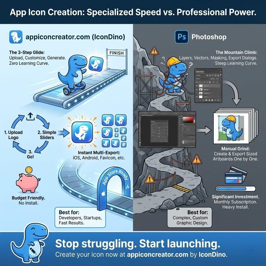
10. Manual Resizing and Compression
The Problem: Manually saving 20 different PNG sizes in Photoshop. This inevitably leads to human error, incorrect naming conventions, and blurry interpolation. The Fix: Use a professional export tool. You should design once at the highest resolution and let an automated system handle the math. Check our guide on the Exporting Workflow for Xcode and Android Studio to see how to do this correctly.
Beyond the Top 10: Advanced Strategic Pitfalls
Testing Your Icon's Emotional Resonance
Before you launch, you need to know if your icon feels right.
- Semantic Differential Scale: Ask a small group of users to rate your icon on scales like "Friendly vs. Professional," "Modern vs. Classic," or "Complex vs. Simple."
- The Blink Test: Show the icon for exactly 0.5 seconds. Ask the user what they remember. If they can't describe the primary shape or color, your icon is too weak (see The Psychology of App Icons for why this matters).
Regulatory and Legal Compliance
Many developers forget that they can't just use any image.
- Trademark Infringement: Using a shape or symbol that is "confusingly similar" to a competitor can get your app removed from the store instantly.
- System Asset Misuse: Never use official Apple or Google system icons (like the Settings gear or the Mail envelope) as your own. It confuses users and violates developer agreements.
A Pre-Launch Checklist for Success
Before you upload your assets to App Store Connect or Play Console, run through this final list:
- Does the icon have a single, clear focal point?
- Is there zero text inside the icon boundaries?
- Have you tested the icon on at least 3 different wallpaper types?
- Is the background layer opaque (for iOS)?
- Have you provided layered foreground/background assets for Android?
- Does the icon's color palette align with your brand's emotional goals?
Conclusion
Your app icon is a gateway. If it looks broken, cluttered, or dated, users will assume your app is too. By avoiding these common pitfalls and leaning into a professional Exporting Workflow for Xcode and Android Studio, you immediately place your app in the top 10% of the market.
Don't let technical errors or poor design choices stay between you and a successful launch. Start with a solid foundation and let your quality shine through.
Make Your Icon Professional Now
Don't settle for "okay." Create an icon that meets every platform guideline and catches every eye.